
Hi, it's Joni here today sharing a couple layouts I've created with the June Capture the Moment kit.
I have to be quite honest...I LOVE the colors...maroons, browns, black and cream....but the patterns (vintage) are really not quite my style. But, I love trying new things and challenging myself, so that's the mindset that I approached this kit with.
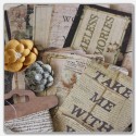
This first layout was a perfect opportunity to scrap my husband's Aunt that we visited last summer when we went "home". I used Prima Time Traveler -The Traveler paper as my background. I also changed the card inside the pocket from the kraft one it came with to a piece of patterned paper. I also used strips of patterned paper to decorate the front of the pocket not covered by the wood plaque.

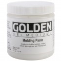
On this wood plaque, I started by using the Prima flower Stamp for a light design on the top left and lower right of the plaque. Then I created the heart by using the stencil and blocking off 2 of the hearts with scrap cardstock paper, so I only had 1 heart showing.

I then used modeling paste to put the heart design onto the wood. While it was still tacky, I stamped the lower left (Anywhere) so it overlapped a little into the heart and I used another stamp (Ticket) to make the larger impression that is just to the left of the flower. I added the Ranger Liquid Pearls to make the black outline. I then added the red Ranger mist by dripping it into the heart and let it set up in the grooves (and the black outline held it in). I also spritzed the entire heart with the mist as well. Added a bit of the trim and a flower from the kit and a bit of twine from my stash.

For me, I find that family photos seem to work well when I have vintage patterns, so I choose a family shot for this layout. The background is Prima Time Traveler - No. 70 paper and the elements to the left and right are the ATC cards. The paper that hold the "Family" title which is also an element along the top is Authentique Abroad paper. A tag, flowers, brads, trim, enamel dots are all from the kit.

I used one of the Maya pockets here, but I used it untraditionally. I unfolded the pocket (and cut it up) and used it behind my photo.

Now, I really wanted to stretch myself and NOT create a vintage layout. I liked the little ticket and brad that said "Let's Travel", so I went through vacation photos and realized that I never told the story behind these photos. I used the stencil (diamonds) from the March Beauty of Nature kit along with some Lindy's Magicals mixed into my modeling paste. I cut banner designs in the paper and then clipped off a few pieces in the same pattern and added them to create a chevron look that supports my "looking up" theme.
The "Today" and " Like" frames are from my stash but since they are also Maya Road, they match perfectly.

I used one of the Maya cards without the pocket, but I didn't want to use "their" journaling lines, so I just cut a piece of kraft cardstock the same size and layered it on top with my title some trim and a brad.

I also added some stamped elements to finish it off.

My journaling:
(Today frame): Driving Down the Las Vegas Strip
TITLE: Memories from the Sun Roof
(Like frame): Great view of the awesome hotels...until the bicycle cop came by and made you get back in the car.
And my last (but favorite) layout using this kit is another "non-vintage" layout!!
I was just feeling nostalgic when I did this one, so I focused on the word "Moments" from the Lace words...I decided that I would put that title directly on my photo. I layered a few of the sheets of paper and mounted the photo on one of the wooden plaques where I inked the wood & some of the trim.

I then wanted to add the Title of "Cherish" ... so I decided to try the new Hazel and Ruby mask letters from the store...you can use them OVER AND OVER again...LOVE that!! See the product list at the bottom of this post to see the letters I'm talking about!!
So, I put them on, misted with the Red Ranger mist...then removed the mask (letters) and outlined with black pen. I decided to also add the Lace word "Life" right on top of the word Cherish.

And some of the burlap flowers, brads, number circles and some designs I made with the Pearl Accents.

So my point today is that even if something (like a kit) isn't necessarily your style, you should embrace the challenge and see what you can do with it. If you always scrap things that you consider "your style" you may never discover that you have a wider range than you originally thought!!!


Love love love love these!!! LOVING that heart on the first one!!!!!!!!!!
ReplyDeleteSo good to "see" you at my blog, missed our interaction. Love how you worked with these papers, you really nailed it!
ReplyDeleteSo good to "see" you at my blog, missed our interaction. Love how you worked with these papers, you really nailed it!
ReplyDelete